Drivers were being judged on metrics they couldn’t see or contest.
✺Uber2019
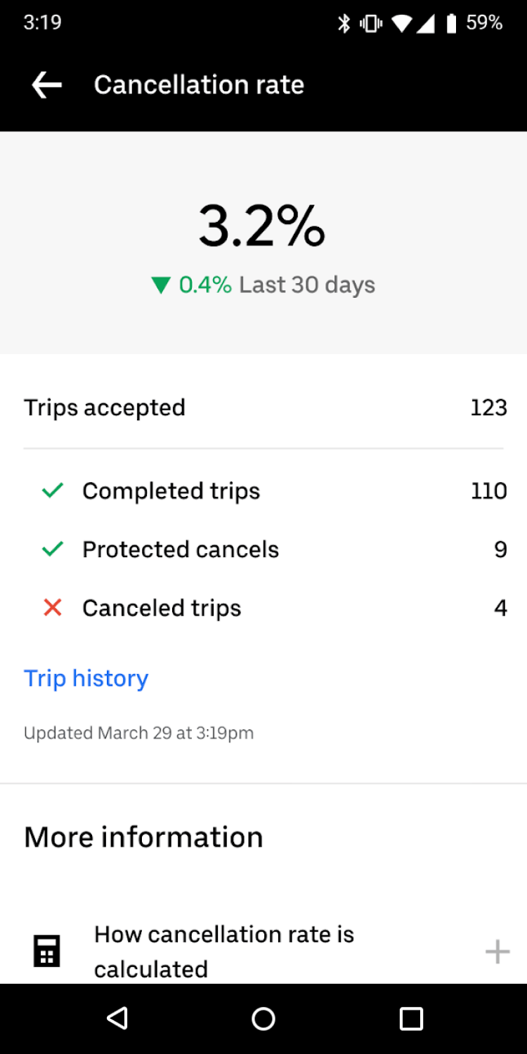
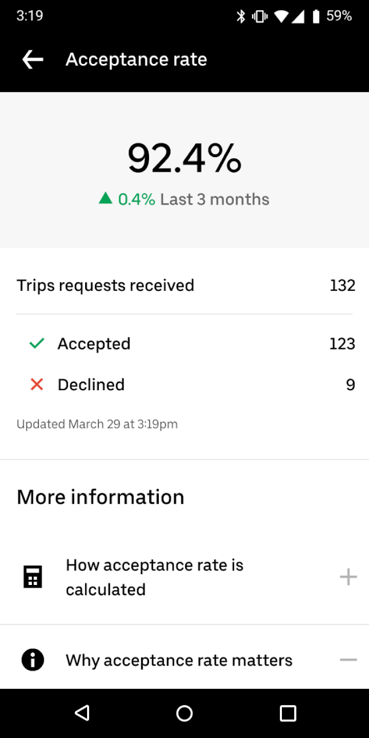
In Uber Pro cities, drivers could see their acceptance and cancellation rates, but only as numbers with no context for what they meant or how they were calculated. They couldn’t audit their metrics or understand what was counting against them.
Three principles shaped the design: show drivers how their numbers are calculated, tell them why it matters, and summarize rather than overwhelm. Early explorations used data visualization and color-coded evaluations, but testing surfaced two problems: drivers correlated ranking language with deactivation risk, and legal flagged that color implying performance judgments created employment classification risk. The final designs dropped the chart, the icons, and the verdicts. What was left was just the number and the math behind it.
One month after shipping: drive cancellation rates dropped 30% and acceptance rates increased 2.3%.